⚖️ JOHNSON LAW GROUP • 2026
Turning .com into a conversion machine
Johnson Law Group is a 30 year old global law firm that made billions from protecting consumers in high-profile group litigations. They launched their personal injury division in 2024 under the sub-brand No Bull Law, but by 2026 it was struggling: 75% of leads left before contacting the firm.
As part of a 5-year push to scale up personal injury, No Bull Law posed a strategic risk. JLG knew the opportunity was there to attract clients in markets where no major firms established dominance (e.g. Morgan & Morgan), but couldn’t quite get a foothold.


MY ROLE & IMPACT
As the Product Design Lead, I ran the end-to-end design process to overhaul the site, resulting in a 2x increase in visitors contacting JLG within 2 months of launch. Plus, the breakdown of users calling vs. filling out the contact form switched from 50/50 to 20/80—a sign the UX was working! Along the way I also:
- Cut design time by 40% using the new design system
- Rebranded their online presence as a holistic global firm, merging 3 disparate entities: JLG US, JLG UK, and No Bull Law
- Created reusable templates and components for quick CMS CRO experiments
- Introduced product development processes (e.g. Linear) to the martech team which cut development time by 33%
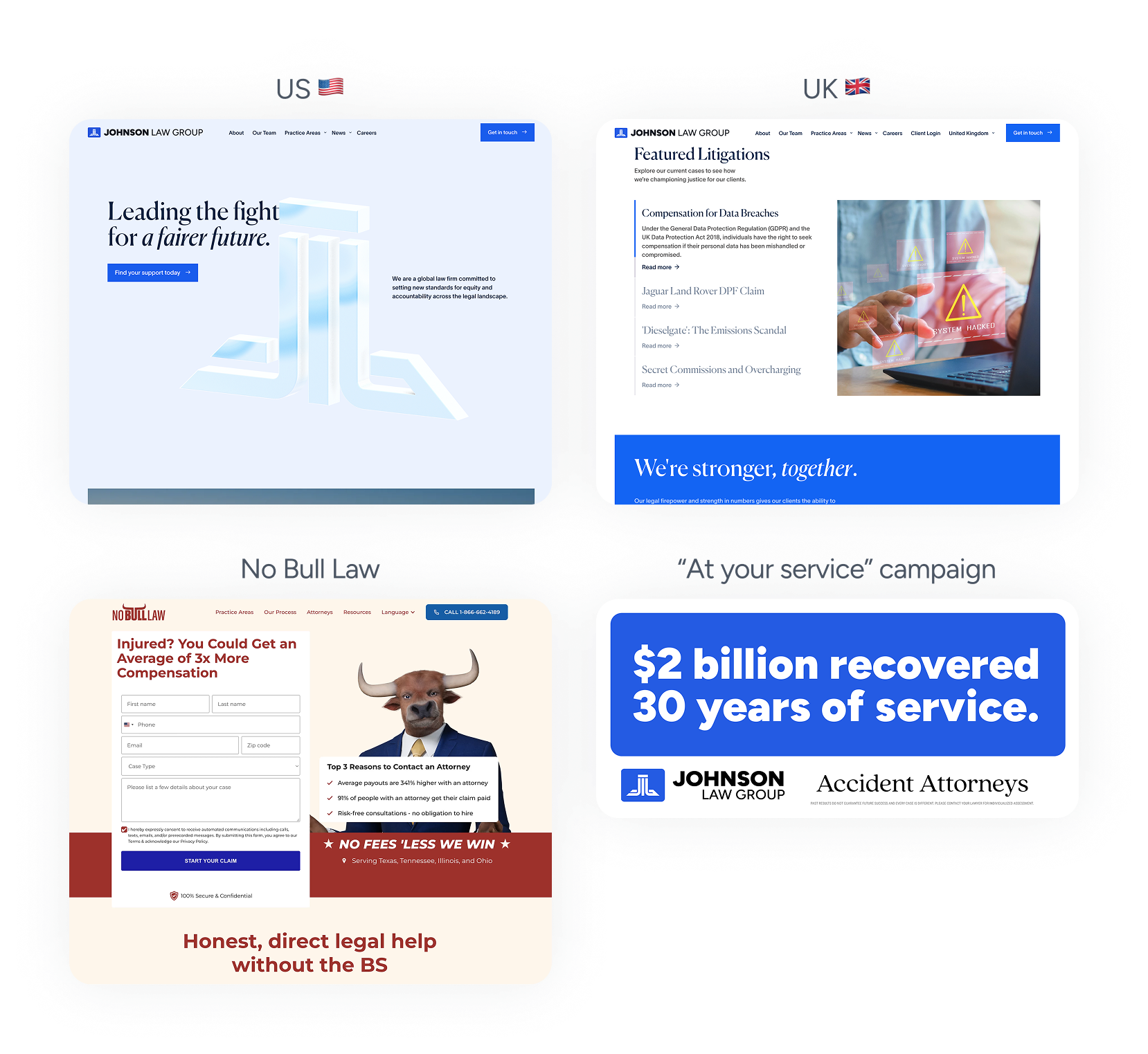
Mixed messages: JLG UK and US were templated and lacked conversion tools, No Bull Law was created for a Houston market and didn’t scale well, and a new ad campaign was launching.
In talking to marketing analytics, leads who didn’t convert, and auditing the current sites, we could see confusion once users landed on the homepage. The sites told different stories, had missed conversion opportunities, and outdated UX.
Car accident victims are looking for a trusted partner who can listen and help ASAP. When they came to JLG, it wasn’t clear why they should use them, what type of law they practiced, or how to get started. Most abandoned the site after a few seconds on the home page, or mid-way through filling out the contact form. Plus, messaging and design on social and out of home was vastly different than our site.
Within the martech team was a huge opportunity for design ops: they had no cohesive design system, content strategy or prioritization frameworks. Creative was disjointed, and important projects slipped through the cracks in favor of whatever was most pressing.
Redesigned to be mobile-first, leaning into our years of experience, amount won for clients, and down-to-earth team.
With the future vision in mind—a conversational AI-powered intake experience—I iterated backwards to create the MVP: a scalable, modern trust-building online experience that brought the firm to life. The design approach factored in several challenges and constraints.
An experience that’s both uniquely American and British
Worked with US and UK stakeholders to build a unified experience, while also tailoring details, like UX, copy and imagery, to each region (like omitting smiling headshots in the UK) to build local trust and convert leads.
Building trust in <3.5 seconds
Our goal was keeping users on the page long enough to build trust and get them to call or fill out the form. To do this, I explored micro-interactions that helped tell the firm’s story, and leaned heavily on our biggest competitive edge: $2B won for clients.
Future-proofed components
During design, I constantly tested and modified spacing, buttons, cards, and typography within other products to ensure they were universally scalable. I worked closely with engineers and content strategy to turn them into easy-to-use CMS templates.
Raising the bar without being overly polished
We learned in research that our audience, while younger and more tech-savvy, also looks for typical attorney-website elements for trust: like lots of CTAs and loud text. The final designs pushed the digital brand several steps forward without removing the humanity.
Crafting a marketing product culture
To speed up launch, I introduced processes—like AI prototyping, iterative QA reviews, beta testing, and Linear feedback tracking—to bring product team efficiencies to marketing.
Using Claude Design to iron out landing page CTA and card interactions.
AI-powered prototyping was a huge help for early buy-in on concepts, quick iterations, user testing, and visualizing complex interactions.
Tools like Figma Make and Claude Design helped bring ideas to life—like rolling text and stacking cards—and then produce code I could hand off to engineers to speed up development.
Rapid user testing of the multi-step conversion funnel with UserLytics participants.
User testing taught us the 3 things that mattered most in building trust with users: not paying anything unless they win, that the firm had a local office, and that the firm helped win cases similar to theirs.
Most clients had never hired a lawyer before, were skeptical, and didn’t know how the process worked. They were hurt and frustrated, and had bills to pay: knowing the firm knew their situation and local laws was a major comfort. These were folded into design by creating localization components and office templates.
“I want to know I can drop by their office if I have to.”


PARTICIPANT, CLEVELAND
The About page, featuring the history of the founder Nick, links to our local offices, and a spotlight on our team outside of work.
The final designs weren’t just a major step forward for the brand, but also an incredibly flexible, scalable marketing system.
Different modules and templates could be reused across the US and UK by anyone on the team via the CMS. This allowed us to launched and iterate quickly each week as we measured performance and made adjustments or tried new combinations for conversion rate optimization.
14


US & UK PAGE TEMPLATES

20+


UNIQUE CONTENT BLOCKS
50+

LANDING PAGES LAUNCHED
The multi-step conversion funnel helped focus the user on bite-sized questions to build momentum, and included trust signals on each screen.
Most importantly, we saw the data trending upwards: not only did lead conversion double, but the mix (of users who call vs. use the contact form) went from a 50/50 split to 20/80 in favor of form-filling.
The redesign is changing how the firm handles volume: new operations training and procedures are being created to handle the influx of form-fill leads, since traditionally JLG acquired leads through calls.
There’s so much more to say about the longer-lasting effects this project had on the org: like how it helped build out the design system for later work, or the new efficiencies that got adopted on the marketing team, and the new copy and photography styles we established and rolled out into the firm’s first-ever brand guide.
There’s also the future vision: AI-powered conversational intake. But I’ll save that for later.
“This design is lightyears ahead of anything any other firm is doing.”
CMO, NEW YORK OFFICE
Want to learn more?
This are just some of the details about this project. Please reach out if you’d like to know more, and I’d be happy to chat or present a case study.

jfchiappone@gmail.com


⚖️ JOHNSON LAW GROUP • 2026
Turning .com into a conversion machine
Johnson Law Group is a 30 year old global law firm that made billions from protecting consumers in high-profile group litigations. They launched their personal injury division in 2024 under the sub-brand No Bull Law, but by 2026 it was struggling: 75% of leads left before contacting the firm.
As part of a 5-year push to scale up personal injury, No Bull Law posed a strategic risk. JLG knew the opportunity was there to attract clients in markets where no major firms established dominance (e.g. Morgan & Morgan), but couldn’t quite get a foothold.
MY ROLE & IMPACT
As the Product Design Lead, I ran the end-to-end design process to overhaul the site, resulting in a 2x increase in visitors contacting JLG within 2 months of launch. Plus, the breakdown of users calling vs. filling out the contact form switched from 50/50 to 20/80—a sign the UX was working! Along the way I also:
- Cut design time by 40% using the new design system
- Rebranded their online presence as a holistic global firm, merging 3 disparate entities: JLG US, JLG UK, and No Bull Law
- Created reusable templates and components for quick CMS CRO experiments
- Introduced product development processes (e.g. Linear) to the martech team which cut development time by 33%
Mixed messages: JLG UK and US were templated and lacked conversion tools, No Bull Law was created for a Houston market and didn’t scale well, and a new ad campaign was launching.
In talking to marketing analytics, leads who didn’t convert, and auditing the current sites, we could see confusion once users landed on the homepage. The sites told different stories, had missed conversion opportunities, and outdated UX.
Car accident victims are looking for a trusted partner who can listen and help ASAP. When they came to JLG, it wasn’t clear why they should use them, what type of law they practiced, or how to get started. Most abandoned the site after a few seconds on the home page, or mid-way through filling out the contact form. Plus, messaging and design on social and out of home was vastly different than our site.
Within the martech team was a huge opportunity for design ops: they had no cohesive design system, content strategy or prioritization frameworks. Creative was disjointed, and important projects slipped through the cracks in favor of whatever was most pressing.
Redesigned to be mobile-first, leaning into our years of experience, amount won for clients, and down-to-earth team.
With the future vision in mind—a conversational AI-powered intake experience—I iterated backwards to create the MVP: a scalable, modern trust-building online experience that brought the firm to life. The design approach factored in several challenges and constraints.
An experience that’s both uniquely American and British
Worked with US and UK stakeholders to build a unified experience, while also tailoring details, like UX, copy and imagery, to each region (like omitting smiling headshots in the UK) to build local trust and convert leads.
Building trust in <3.5 seconds
Our goal was keeping users on the page long enough to build trust and get them to call or fill out the form. To do this, I explored micro-interactions that helped tell the firm’s story, and leaned heavily on our biggest competitive edge: $2B won for clients.
Future-proofed components
During design, I constantly tested and modified spacing, buttons, cards, and typography within other products to ensure they were universally scalable. I worked closely with engineers and content strategy to turn them into easy-to-use CMS templates.
Raising the bar without being overly polished
We learned in research that our audience, while younger and more tech-savvy, also looks for typical attorney-website elements for trust: like lots of CTAs and loud text. The final designs pushed the digital brand several steps forward without removing the humanity.
Crafting a marketing product culture
To speed up launch, I introduced processes—like AI prototyping, iterative QA reviews, beta testing, and Linear feedback tracking—to bring product team efficiencies to marketing.
Using Claude Design to iron out landing page CTA and card interactions.
AI-powered prototyping was a huge help for early buy-in on concepts, quick iterations, user testing, and visualizing complex interactions.
Tools like Figma Make and Claude Design helped bring ideas to life—like rolling text and stacking cards—and then produce code I could hand off to engineers to speed up development.
Rapid user testing of the multi-step conversion funnel with UserLytics participants.
User testing taught us the 3 things that mattered most in building trust with users: not paying anything unless they win, that the firm had a local office, and that the firm helped win cases similar to theirs.
Most clients had never hired a lawyer before, were skeptical, and didn’t know how the process worked. They were hurt and frustrated, and had bills to pay: knowing the firm knew their situation and local laws was a major comfort. These were folded into design by creating localization components and office templates.
“I want to know I can drop by their office if I have to.”
PARTICIPANT, CLEVELAND
The About page, featuring the history of the founder Nick, links to our local offices, and a spotlight on our team outside of work.
The final designs weren’t just a major step forward for the brand, but also an incredibly flexible, scalable marketing system.
Different modules and templates could be reused across the US and UK by anyone on the team via the CMS. This allowed us to launched and iterate quickly each week as we measured performance and made adjustments or tried new combinations for conversion rate optimization.
14
US & UK PAGE TEMPLATES

20+
UNIQUE CONTENT BLOCKS
50+
LANDING PAGES LAUNCHED
The multi-step conversion funnel helped focus the user on bite-sized questions to build momentum, and included trust signals on each screen.
Most importantly, we saw the data trending upwards: not only did lead conversion double, but the mix (of users who call vs. use the contact form) went from a 50/50 split to 20/80 in favor of form-filling.
The redesign is changing how the firm handles volume: new operations training and procedures are being created to handle the influx of form-fill leads, since traditionally JLG acquired leads through calls.
There’s so much more to say about the longer-lasting effects this project had on the org: like how it helped build out the design system for later work, or the new efficiencies that got adopted on the marketing team, and the new copy and photography styles we established and rolled out into the firm’s first-ever brand guide.
There’s also the future vision: AI-powered conversational intake. But I’ll save that for later.
“This design is lightyears ahead of anything any other firm is doing.”
CMO, NEW YORK OFFICE
Want to learn more?
This are just some of the details about this project. Please reach out if you’d like to know more, and I’d be happy to chat or present a case study.
jfchiappone@gmail.com
⚖️ JOHNSON LAW GROUP • 2026
Turning .com into a conversion machine
Johnson Law Group is a 30 year old global law firm that made billions from protecting consumers in high-profile group litigations. They launched their personal injury division in 2024 under the sub-brand No Bull Law, but by 2026 it was struggling: 75% of leads left before contacting the firm.
As part of a 5-year push to scale up personal injury, No Bull Law posed a strategic risk. JLG knew the opportunity was there to attract clients in markets where no major firms established dominance (e.g. Morgan & Morgan), but couldn’t quite get a foothold.


MY ROLE & IMPACT
As the Product Design Lead, I ran the end-to-end design process to overhaul the site, resulting in a 2x increase in visitors contacting JLG within 2 months of launch. Plus, the breakdown of users calling vs. filling out the contact form switched from 50/50 to 20/80—a sign the UX was working! Along the way I also:
- Cut design time by 40% using the new design system
- Rebranded their online presence as a holistic global firm, merging 3 disparate entities: JLG US, JLG UK, and No Bull Law
- Created reusable templates and components for quick CMS CRO experiments
- Introduced product development processes (e.g. Linear) to the martech team which cut development time by 33%
Mixed messages: JLG UK and US were templated and lacked conversion tools, No Bull Law was created for a Houston market and didn’t scale well, and a new ad campaign was launching.
In talking to marketing analytics, leads who didn’t convert, and auditing the current sites, we could see confusion once users landed on the homepage. The sites told different stories, had missed conversion opportunities, and outdated UX.
Car accident victims are looking for a trusted partner who can listen and help ASAP. When they came to JLG, it wasn’t clear why they should use them, what type of law they practiced, or how to get started. Most abandoned the site after a few seconds on the home page, or mid-way through filling out the contact form. Plus, messaging and design on social and out of home was vastly different than our site.
Within the martech team was a huge opportunity for design ops: they had no cohesive design system, content strategy or prioritization frameworks. Creative was disjointed, and important projects slipped through the cracks in favor of whatever was most pressing.
Redesigned to be mobile-first, leaning into our years of experience, amount won for clients, and down-to-earth team.
With the future vision in mind—a conversational AI-powered intake experience—I iterated backwards to create the MVP: a scalable, modern trust-building online experience that brought the firm to life. The design approach factored in several challenges and constraints.
An experience that’s both uniquely American and British
Worked with US and UK stakeholders to build a unified experience, while also tailoring details, like UX, copy and imagery, to each region (like omitting smiling headshots in the UK) to build local trust and convert leads.
Building trust in <3.5 seconds
Our goal was keeping users on the page long enough to build trust and get them to call or fill out the form. To do this, I explored micro-interactions that helped tell the firm’s story, and leaned heavily on our biggest competitive edge: $2B won for clients.
Future-proofed components
During design, I constantly tested and modified spacing, buttons, cards, and typography within other products to ensure they were universally scalable. I worked closely with engineers and content strategy to turn them into easy-to-use CMS templates.
Raising the bar without being overly polished
We learned in research that our audience, while younger and more tech-savvy, also looks for typical attorney-website elements for trust: like lots of CTAs and loud text. The final designs pushed the digital brand several steps forward without removing the humanity.
Crafting a marketing product culture
To speed up launch, I introduced processes—like AI prototyping, iterative QA reviews, beta testing, and Linear feedback tracking—to bring product team efficiencies to marketing.
Using Claude Design to iron out landing page CTA and card interactions.
AI-powered prototyping was a huge help for early buy-in on concepts, quick iterations, user testing, and visualizing complex interactions.
Tools like Figma Make and Claude Design helped bring ideas to life—like rolling text and stacking cards—and then produce code I could hand off to engineers to speed up development.
Rapid user testing of the multi-step conversion funnel with UserLytics participants.
User testing taught us the 3 things that mattered most in building trust with users: not paying anything unless they win, that the firm had a local office, and that the firm helped win cases similar to theirs.
Most clients had never hired a lawyer before, were skeptical, and didn’t know how the process worked. They were hurt and frustrated, and had bills to pay: knowing the firm knew their situation and local laws was a major comfort. These were folded into design by creating localization components and office templates.
“I want to know I can drop by their office if I have to.”


PARTICIPANT, CLEVELAND
The About page, featuring the history of the founder Nick, links to our local offices, and a spotlight on our team outside of work.
The final designs weren’t just a major step forward for the brand, but also an incredibly flexible, scalable marketing system.
Different modules and templates could be reused across the US and UK by anyone on the team via the CMS. This allowed us to launched and iterate quickly each week as we measured performance and made adjustments or tried new combinations for conversion rate optimization.
14


US & UK PAGE TEMPLATES

20+


UNIQUE CONTENT BLOCKS
50+

LANDING PAGES LAUNCHED
The multi-step conversion funnel helped focus the user on bite-sized questions to build momentum, and included trust signals on each screen.
Most importantly, we saw the data trending upwards: not only did lead conversion double, but the mix (of users who call vs. use the contact form) went from a 50/50 split to 20/80 in favor of form-filling.
The redesign is changing how the firm handles volume: new operations training and procedures are being created to handle the influx of form-fill leads, since traditionally JLG acquired leads through calls.
There’s so much more to say about the longer-lasting effects this project had on the org: like how it helped build out the design system for later work, or the new efficiencies that got adopted on the marketing team, and the new copy and photography styles we established and rolled out into the firm’s first-ever brand guide.
There’s also the future vision: AI-powered conversational intake. But I’ll save that for later.
“This design is lightyears ahead of anything any other firm is doing.”
CMO, NEW YORK OFFICE
Want to learn more?
This are just some of the details about this project. Please reach out if you’d like to know more, and I’d be happy to chat or present a case study.
jfchiappone@gmail.com

