⚖️ JOHNSON LAW GROUP • 2026
Making settlement payments fast, easy and scalable
Johnson Law Group is a global firm that made a name for itself protecting consumers from high-profile corporate harm. A major case involving mis-sold car financing in the UK was about to settle for millions of pounds, meaning 250,000+ clients needed a way to receive payment.
Using a third party payment vendor came with huge risks: UX issues, operations costs handling client questions, and high price tags. The firm needed an option that freed it from service fees, provided a trust-building customer experience, and scaled to any future case.
The faster we helped clients collect settlements, the better we could cover costs, and reinvest in the firm to scale up operations. The goal was to get 90% of clients to complete the flow in-app, vs. needing manual assistance from operations. This was by far the largest and most complex feature of the UK client portal to date.


MY ROLE & IMPACT
As the Product Design Lead, I led the design in close collaboration with our UK legal stakeholders resulting in a payment flow that saved the firm ~$6M in third-party vendor costs and cutting down inbound calls by 63%. Long term, the payment flow could quickly be launched for other products, like our personal injury client portal.
Using AI-assisted prototyping to explore edge cases where clients have multiple vehicles and settlements.
I worked closely with with our PM, lead engineer, and head of legal operations in the UK to explore the complexity of the case and settlement mechanics, and align on foundational designs.
A moving target
The case involved 12+ major car manufacturers, and was the first of its kind. New rules and restrictions on settlements were getting created each week, which involved working closely with our UK attorneys to translate them into design requirements.
Designing for trust to reduce ops handling
About 33% of clients were aged 55-60, and we knew from talking with ops that they were the biggest group to get stuck and reach out for help. We needed the experience to build trust and clarity in order to deflect calls and emails.
The first piece of good news in months
Most clients had been waiting for settlement news for over a year. Not only was payment the big grand finale, but a high-stakes moment of understanding fees and timelines.
Banking complexity
The experience had to work well with Tink, the most popular banking app in the UK. That required designing around multiple restrictions and edge cases: like if a client’s bank account failed validation, they didn’t have one, or refused payment.
AI-assisted client sentiment analysis
I worked with our AI product manager to create a Copilot automation that summarized client emails: this gave me insight into UX issues and low hanging fruit to solve for as I began the payment flow designs.
If the firm thinks they can get a stronger offer, the experience explains why and nudges the client towards countering.
The final design was a payment experience that celebrated the win, but carefully guided the client towards their best option—all while explaining and setting expectations.


Each step included in-context FAQs and definitions to reduce confusion and inbound questions


Testing with attorneys, I ensured the experience scaled well to any other case type we launched in the future


The design factored in nuances of individual claims, like if someone had 2 affected vehicles, or if one vehicle’s manufacturer settled but another didn’t


Before deciding, the client was presented with a clear breakdown of fees, and the reasons to either take the offer or counter it


Date transparency was a design principle: the next step and when to expect it was always clearly displayed throughout
“These clients have been waiting for a year or more, this is big news to them.”


PCP DOCKET MANAGER, LONDON
Clients could connect their preferred bank securely through Tink, or do it manually, all within the UK client portal.
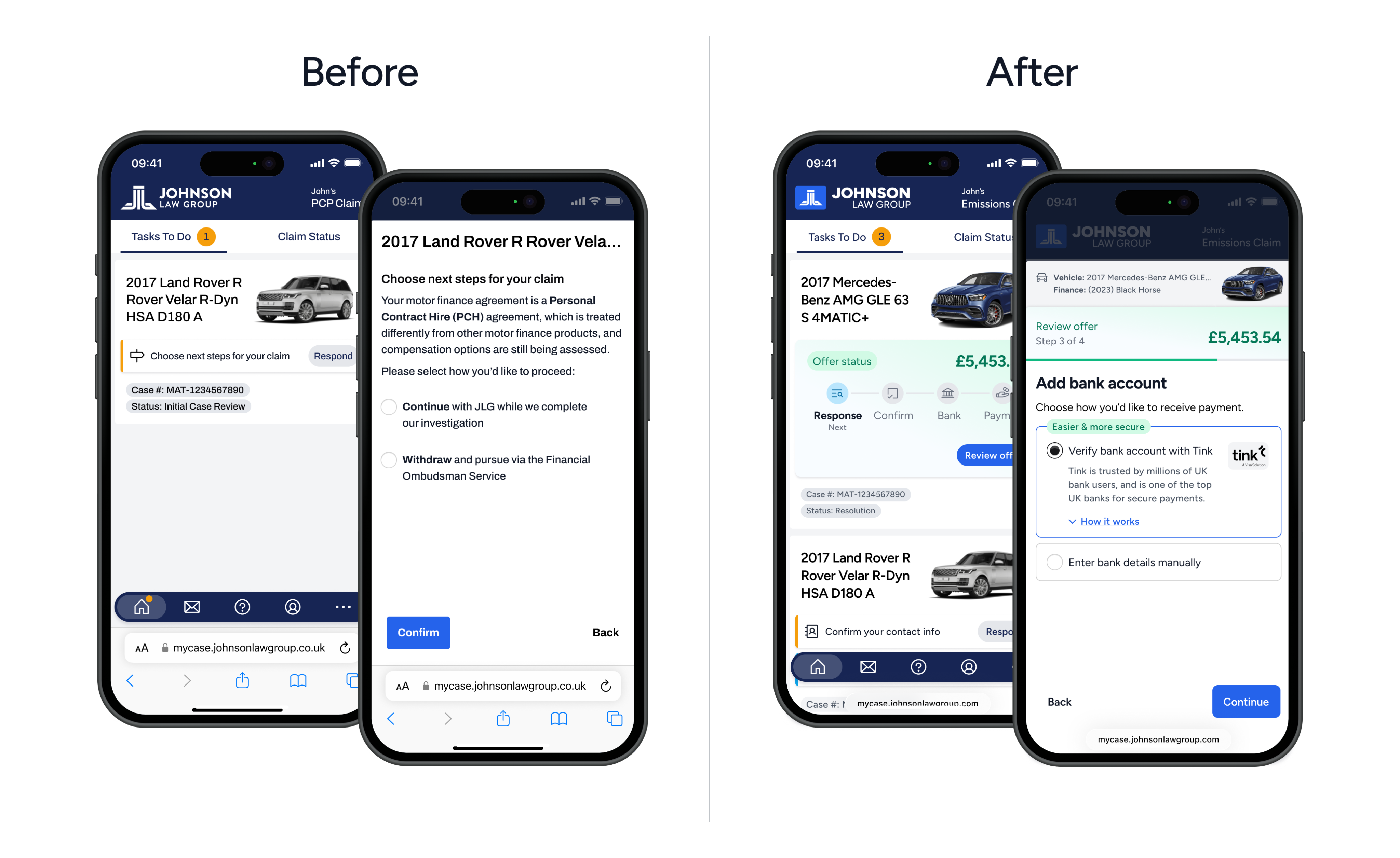
Before and after a handful of global UX improvements squeezed in: more readable typeface (from Archivo to Figtree), improved hierarchy, new components, corner radii, colors and more.
The payment flow is projected to save the firm ~$6M by removing the fees and hassle of utilizing a third party, and it cut down on payment-related inbound calls and emails by 63%.
As icing on the cake, I was also able to make several much-needed improvements along the way to the UK client experience, including redesigned task and case cards, new font styles for increased readability, and better transitions between screens.
Plus, we’re already re-using the designs as we create the US client experience, which cut weeks off our launch timeline.
Want to learn more?
This are just some of the details about this project. Please reach out if you’d like to know more, and I’d be happy to chat or present a case study.

jfchiappone@gmail.com


⚖️ JOHNSON LAW GROUP • 2026
Making settlement payments fast, easy and scalable
Johnson Law Group is a global firm that made a name for itself protecting consumers from high-profile corporate harm. A major case involving mis-sold car financing in the UK was about to settle for millions of pounds, meaning 250,000+ clients needed a way to receive payment.
Using a third party payment vendor came with huge risks: UX issues, operations costs handling client questions, and high price tags. The firm needed an option that freed it from service fees, provided a trust-building customer experience, and scaled to any future case.
The faster we helped clients collect settlements, the better we could cover costs, and reinvest in the firm to scale up operations. The goal was to get 90% of clients to complete the flow in-app, vs. needing manual assistance from operations. This was by far the largest and most complex feature of the UK client portal to date.
MY ROLE & IMPACT
As the Product Design Lead, I led the design in close collaboration with our UK legal stakeholders resulting in a payment flow that saved the firm ~$6M in third-party vendor costs and cutting down inbound calls by 63%. Long term, the payment flow could quickly be launched for other products, like our personal injury client portal.
Using AI-assisted prototyping to explore edge cases where clients have multiple vehicles and settlements.
I worked closely with with our PM, lead engineer, and head of legal operations in the UK to explore the complexity of the case and settlement mechanics, and align on foundational designs.
A moving target
The case involved 12+ major car manufacturers, and was the first of its kind. New rules and restrictions on settlements were getting created each week, which involved working closely with our UK attorneys to translate them into design requirements.
Designing for trust to reduce ops handling
About 33% of clients were aged 55-60, and we knew from talking with ops that they were the biggest group to get stuck and reach out for help. We needed the experience to build trust and clarity in order to deflect calls and emails.
The first piece of good news in months
Most clients had been waiting for settlement news for over a year. Not only was payment the big grand finale, but a high-stakes moment of understanding fees and timelines.
Banking complexity
The experience had to work well with Tink, the most popular banking app in the UK. That required designing around multiple restrictions and edge cases: like if a client’s bank account failed validation, they didn’t have one, or refused payment.
AI-assisted client sentiment analysis
I worked with our AI product manager to create a Copilot automation that summarized client emails: this gave me insight into UX issues and low hanging fruit to solve for as I began the payment flow designs.
If the firm thinks they can get a stronger offer, the experience explains why and nudges the client towards countering.
The final design was a payment experience that celebrated the win, but carefully guided the client towards their best option—all while explaining and setting expectations.
Each step included in-context FAQs and definitions to reduce confusion and inbound questions
Testing with attorneys, I ensured the experience scaled well to any other case type we launched in the future
The design factored in nuances of individual claims, like if someone had 2 affected vehicles, or if one vehicle’s manufacturer settled but another didn’t
Before deciding, the client was presented with a clear breakdown of fees, and the reasons to either take the offer or counter it
Date transparency was a design principle: the next step and when to expect it was always clearly displayed throughout
“These clients have been waiting for a year or more, this is big news to them.”
PCP DOCKET MANAGER, LONDON
Clients could connect their preferred bank securely through Tink, or do it manually, all within the UK client portal.
Before and after a handful of global UX improvements squeezed in: more readable typeface (from Archivo to Figtree), improved hierarchy, new components, corner radii, colors and more.
The payment flow is projected to save the firm ~$6M by removing the fees and hassle of utilizing a third party, and it cut down on payment-related inbound calls and emails by 63%.
As icing on the cake, I was also able to make several much-needed improvements along the way to the UK client experience, including redesigned task and case cards, new font styles for increased readability, and better transitions between screens.
Plus, we’re already re-using the designs as we create the US client experience, which cut weeks off our launch timeline.
Want to learn more?
This are just some of the details about this project. Please reach out if you’d like to know more, and I’d be happy to chat or present a case study.
jfchiappone@gmail.com
⚖️ JOHNSON LAW GROUP • 2026
Making settlement payments fast, easy and scalable
Johnson Law Group is a global firm that made a name for itself protecting consumers from high-profile corporate harm. A major case involving mis-sold car financing in the UK was about to settle for millions of pounds, meaning 250,000+ clients needed a way to receive payment.
Using a third party payment vendor came with huge risks: UX issues, operations costs handling client questions, and high price tags. The firm needed an option that freed it from service fees, provided a trust-building customer experience, and scaled to any future case.
The faster we helped clients collect settlements, the better we could cover costs, and reinvest in the firm to scale up operations. The goal was to get 90% of clients to complete the flow in-app, vs. needing manual assistance from operations. This was by far the largest and most complex feature of the UK client portal to date.


MY ROLE & IMPACT
As the Product Design Lead, I led the design in close collaboration with our UK legal stakeholders resulting in a payment flow that saved the firm ~$6M in third-party vendor costs and cutting down inbound calls by 63%. Long term, the payment flow could quickly be launched for other products, like our personal injury client portal.
Using AI-assisted prototyping to explore edge cases where clients have multiple vehicles and settlements.
I worked closely with with our PM, lead engineer, and head of legal operations in the UK to explore the complexity of the case and settlement mechanics, and align on foundational designs.
A moving target
The case involved 12+ major car manufacturers, and was the first of its kind. New rules and restrictions on settlements were getting created each week, which involved working closely with our UK attorneys to translate them into design requirements.
Designing for trust to reduce ops handling
About 33% of clients were aged 55-60, and we knew from talking with ops that they were the biggest group to get stuck and reach out for help. We needed the experience to build trust and clarity in order to deflect calls and emails.
The first piece of good news in months
Most clients had been waiting for settlement news for over a year. Not only was payment the big grand finale, but a high-stakes moment of understanding fees and timelines.
Banking complexity
The experience had to work well with Tink, the most popular banking app in the UK. That required designing around multiple restrictions and edge cases: like if a client’s bank account failed validation, they didn’t have one, or refused payment.
AI-assisted client sentiment analysis
I worked with our AI product manager to create a Copilot automation that summarized client emails: this gave me insight into UX issues and low hanging fruit to solve for as I began the payment flow designs.
If the firm thinks they can get a stronger offer, the experience explains why and nudges the client towards countering.
The final design was a payment experience that celebrated the win, but carefully guided the client towards their best option—all while explaining and setting expectations.


Each step included in-context FAQs and definitions to reduce confusion and inbound questions


Testing with attorneys, I ensured the experience scaled well to any other case type we launched in the future


The design factored in nuances of individual claims, like if someone had 2 affected vehicles, or if one vehicle’s manufacturer settled but another didn’t


Before deciding, the client was presented with a clear breakdown of fees, and the reasons to either take the offer or counter it


Date transparency was a design principle: the next step and when to expect it was always clearly displayed throughout
“These clients have been waiting for a year or more, this is big news to them.”


PCP DOCKET MANAGER, LONDON
Clients could connect their preferred bank securely through Tink, or do it manually, all within the UK client portal.
Before and after a handful of global UX improvements squeezed in: more readable typeface (from Archivo to Figtree), improved hierarchy, new components, corner radii, colors and more.
The payment flow is projected to save the firm ~$6M by removing the fees and hassle of utilizing a third party, and it cut down on payment-related inbound calls and emails by 63%.
As icing on the cake, I was also able to make several much-needed improvements along the way to the UK client experience, including redesigned task and case cards, new font styles for increased readability, and better transitions between screens.
Plus, we’re already re-using the designs as we create the US client experience, which cut weeks off our launch timeline.
Want to learn more?
This are just some of the details about this project. Please reach out if you’d like to know more, and I’d be happy to chat or present a case study.
jfchiappone@gmail.com

